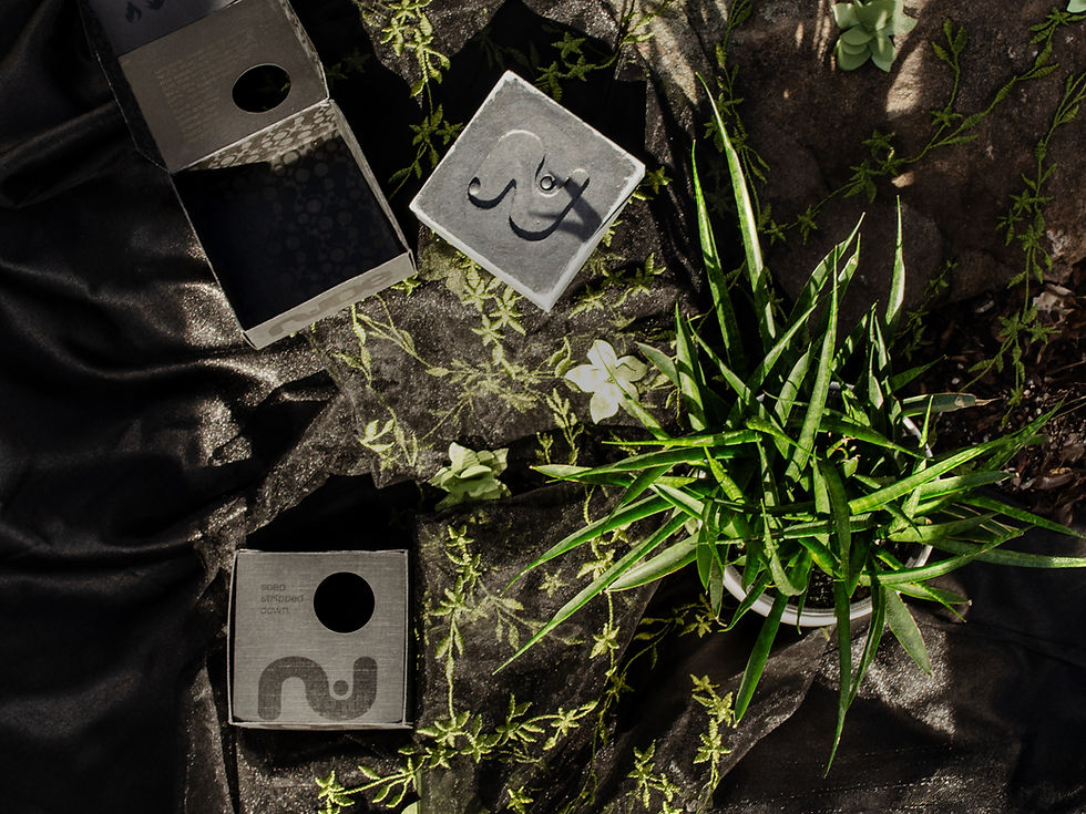

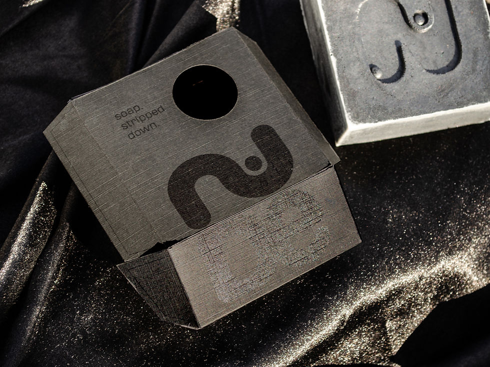

I developed the branding and packaging for NUDE, an artisanal handcrafted soap line targeting millennial, eco-conscious men redefining modern masculinity. NUDE's tagline, “Soap, stripped down,” reflects its minimalist ethos and dedication to sustainability. With only five all-natural and organic ingredients—honey, charcoal, sea salt, tea tree oil, and aloe vera—NUDE offers raw, honest care for both skin and the planet. The packaging design embraces a bold, modern aesthetic with an emphasis on simplicity and visual intrigue. The typography takes center stage, featuring a custom treatment of the wordmark "nude." The black-on-black palette creates a striking contrast that reinforces the stripped-down concept, while dynamic patterns of circles add texture and depth. These graphic elements evoke natural motifs, balancing structure with organic fluidity. Essential product information, including ingredients and weight, is displayed in a clean, minimalist layout to maintain readability and highlight the soap’s purity.
The Process

Sketching
After selecting the company name for my soap company, I began by sketching different iterations of the letterform.


Iteration
From my sketches, I picked two different directions. I iterated on those letterforms and created a set of logos for each direction.The first direction focused on hand-lettering, while the other direction honed in on organic shapes and movement.


Checklist
After I selected the strongest logo from each direction, I tested them out on different materials and in different settings to get a feel for how each logo might operate in the world.


Letterform
From these checklists, I moved forward with the second option and refined the partnering letterform which would eventually be used on the soap. I liked the starting position of this letterform, but the serifs were uneven and distracting. Removing the left serif on the cut out, and moving the circle the left made for a more natural and balanced "N."


Packaging
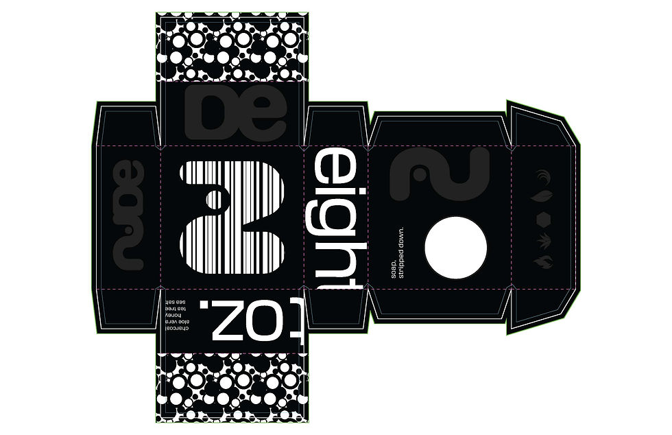
With the logo and letterform finalized, I transitioned to designing the packaging. I began by creating a die-line template in Illustrator, which served as the foundation for exploring various layouts and color schemes. My primary focus was on ensuring the design seamlessly wrapped around the packaging, encouraging users to engage with and spend time interacting with the box. I experimented with placing the logo across multiple planes and thoughtfully considered the placement of the die-cut to enhance the overall user experience. Ultimately, I chose the first option because I was excited to explore the possibilities of printing black ink on black paper.


Refinement
Initially, I planned to print gray ink on black paper. However, after conducting test prints, I realized this approach would not yield the desired results. Further research into the differences between true black and rich black revealed that adjustments were necessary to enhance the design’s legibility. I revised my initial design, converting all elements to either white or rich black. This change significantly improved readability and added a polished, shiny finish that complemented the matte linen paper I had chosen for the project.


3D Printing + Soap Making
With the packaging finalized, I moved on to creating the mold for the soap. Using Tinkercad, I designed a 3D file for printing. Once the 3D print was complete, I poured a silicone mixture over it to produce the mold for the soap base. Although the final soap bar had some air bubbles, I think they add a unique and appealing touch to the finished product.